By Elizabeth R. for our “99 Ways to Make a Positive Difference in Your Pharmacy” blog series
Did you know that color impacts us psychologically? You might have. But do you know exactly how? Join me on a short journey along the spectrum highway; I promise there are some fascinating bits of knowledge ahead.
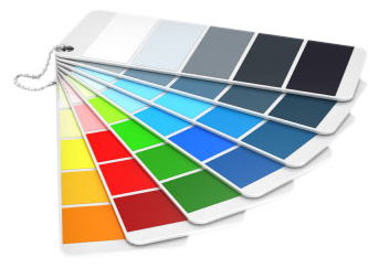
Research has shown that the colors in our surroundings can influence our emotions and state of mind, which influence our decision-making as well. Color is light and light is energy1. Colors can stimulate, excite, depress, tranquilize, increase appetite, and create a feeling of warmth or coolness. This is known as chromodynamics. Here’s what some experts say about certain colors and the moods they generate:
WARM COLORS (Reds, Yellows, Oranges)
express a range from comfort and warmth, to hostility and anger
COOL COLORS (Greens, Blues, Purples)
express calmness, peace and sadness
WHITES
express things like unity (it’s the unity of all colors), purity, innocence, cleanliness, sense of space and surrender (white flag)
BLACKS
express things like elegance (black-tie affair), authority, strength, thinning/slimming, evil and mourning
GRAYS
express things like neutrality, timelessness, class and practicality; gray is a neutral color that can enhance any other color it surrounds
Since the basic colors of the rainbow also all have degrees of tone and hue, I came up with this analogy: a color tone is much like a "tone" of voice — a statement can be sent and received in dramatically different ways depending on your tone of voice. Think about the mood you're trying to achieve when choosing your tint!
Some Pinwheel Points:
- Because the eye focuses the color green directly on the retina, it’s said to be less stressful on your eye muscles. Imagine that! Green is also the universal color of nature, which we subconsciously learn as we grow.
- Don’t forget to keep in mind color-association. Things such as Ronald McDonald, Christmas and the Green Bay Packers (or any pro sports team) have inadvertently claimed certain color combinations, making us immediately associate those color combos with them.
- An executive for a paint company received complaints from workers in a blue office that the office was too cold. When the offices were painted a warm peach, the sweaters came off even though the temperature had not changed (although, I still don’t recommend painting your walls peach…).
To wrap up our colorful road trip, I’ll note what I’ve found to be an overall recommendation. For your store, choose a more neutral or warm color, with a splash of an accent color somewhere to relieve the boring perception a single color palette can give. And just my opinion – steer clear of bright white walls.
Now the world of color is yours to explore!
1http://www.pantone.com/pages/Pantone/Pantone.aspx?pg=19382&ca=29

Â
As a member of the Visual Assets department, Elizabeth is responsible for capturing, editing and finishing product images. In addition to her work with product images and monthly production materials, she also helps write content for the Data Assets Team and assists with creative development and execution of marketing services projects.Â
Â