by Jen Johnston, part 10 of the At Shelf: Signs blog series
There are a few general principles to shelf sign design that apply to every type of shelf talker – wobbler, wiggler, flat, aisle violator, aisle blade, etc. But one stands out above them all: LESS IS MORE.
It makes sense when you think about the goal of a shelf sign – to grab the attention of a passerby. The shelf sign will not sell your product, so resist the urge to include a litany of all of your features and benefits – it will NOT be read. Shelf signs “simply” need to pique a shopper’s curiosity so they pick up the product and look at the packaging. It is here that the details of your product differentiators will lie.
This approach is not unlike a billboard. The cardinal rule for billboards is keep copy to under seven words. For most shelf signs, I recommend the same or less. And be sure to use a legible, professional font with high contrast. And although the typical shopper is not a font snob, this is still not the place for Comic Sans.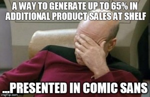
If you choose to include a product photo, make sure it is a professional, high resolution photograph. I know this probably seems obvious, but I have actually seen POS materials with product photos I am sure were taken in the marketing manager’s basement and edited by their 16-year-old nephew. Definitely not effective at shelf.
In summary:
- Shelf sign goal = grab attention
- Shelf sign goal ≠sell your product
- Keep it under seven words when possible
- Use a legible, professional font with high contrast
- Product photos must be professional
I enjoy helping our clients craft succinct messages that resonate with their target audience at shelf. I really didn’t want this post to come across as a sales pitch, but really…if you need help in this arena, please email our Director of Business Development, Angela, so we can get started!